Menez
Year
2024
Type
Architecture, Interiors
At Menez, we designed an unexpectable flower shop, where raw materials give way for the flowers to take center stage.
Menez
Year
2024
Type
Architecture, Interiors
At Menez, we designed an unexpectable flower shop, where raw materials give way for the flowers to take center stage.
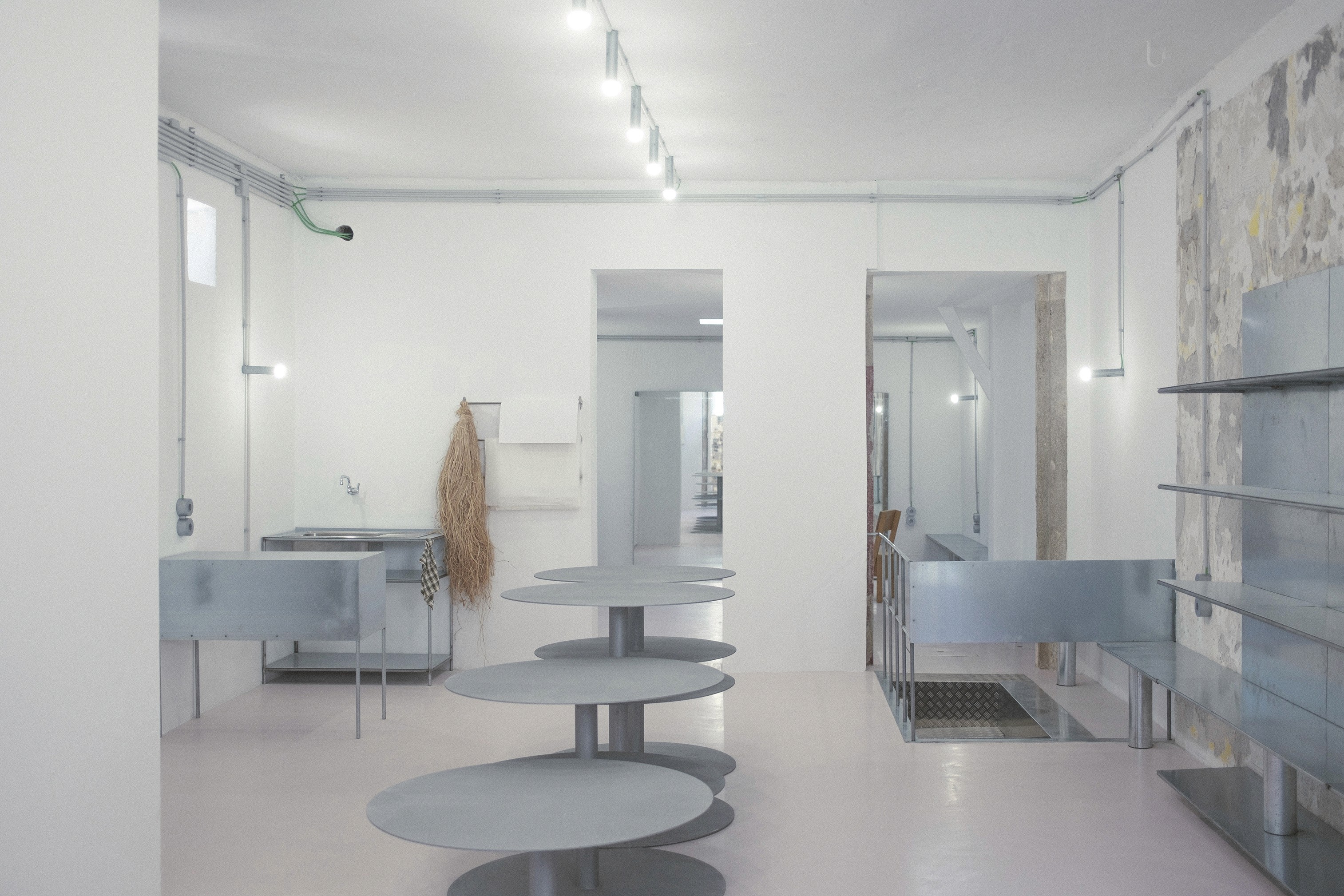

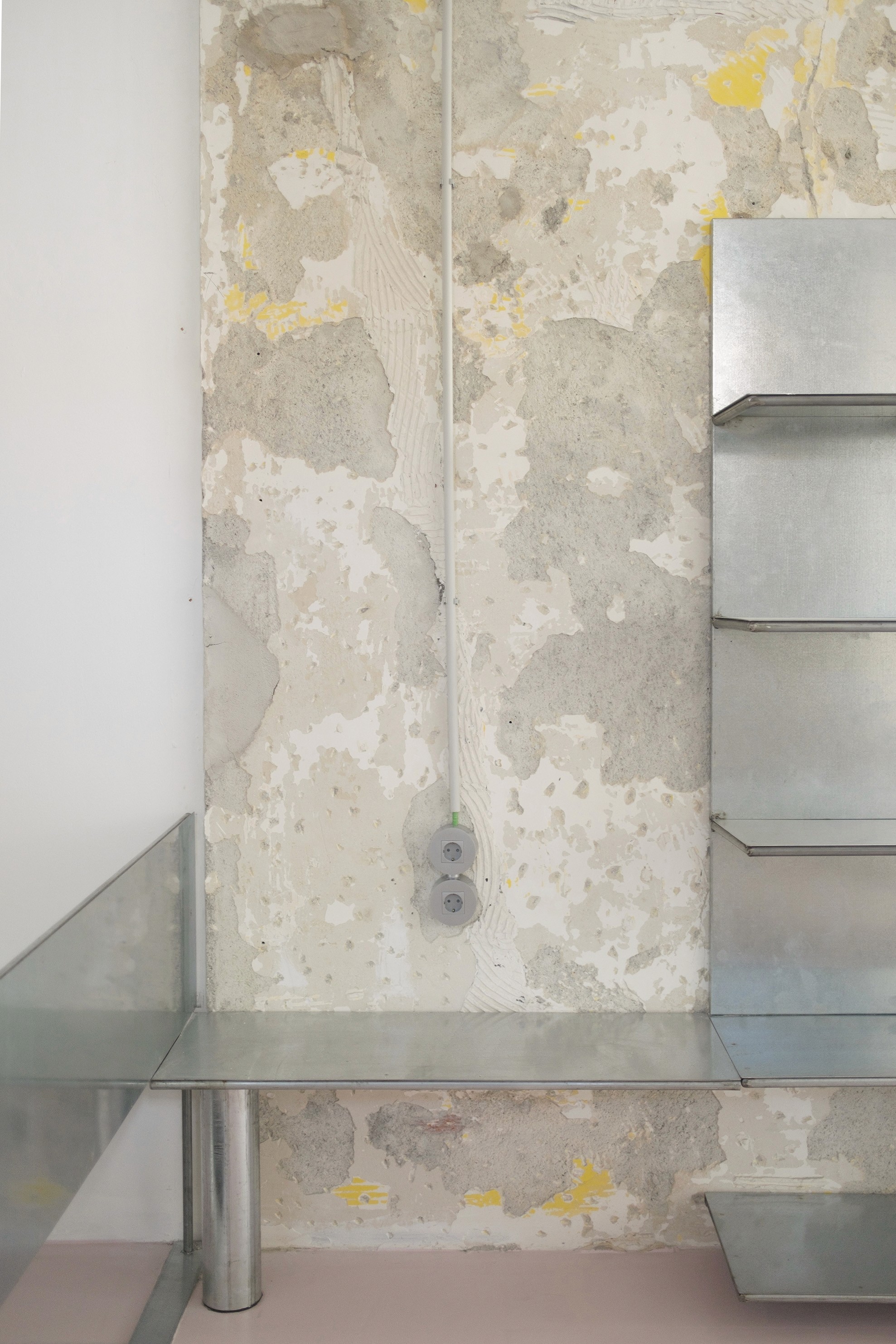
Our collaboration with the clients began by sharing references and understanding their goals for this new chapter of the brand. From the outset, we felt a perfect connection. The existing space, characterized by a long, narrow layout, dark tones, a variety of materials, and multiple partitions, created a dense and segmented environment.
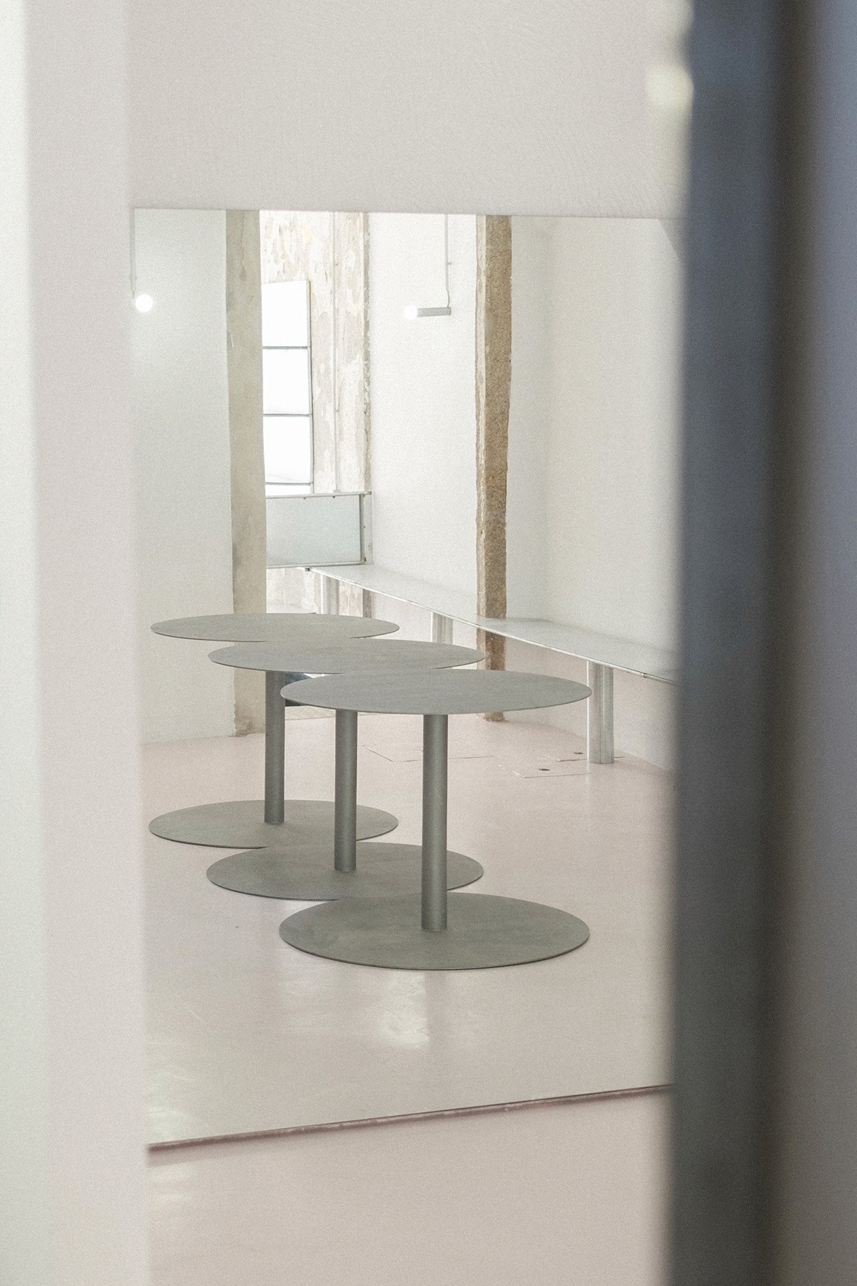
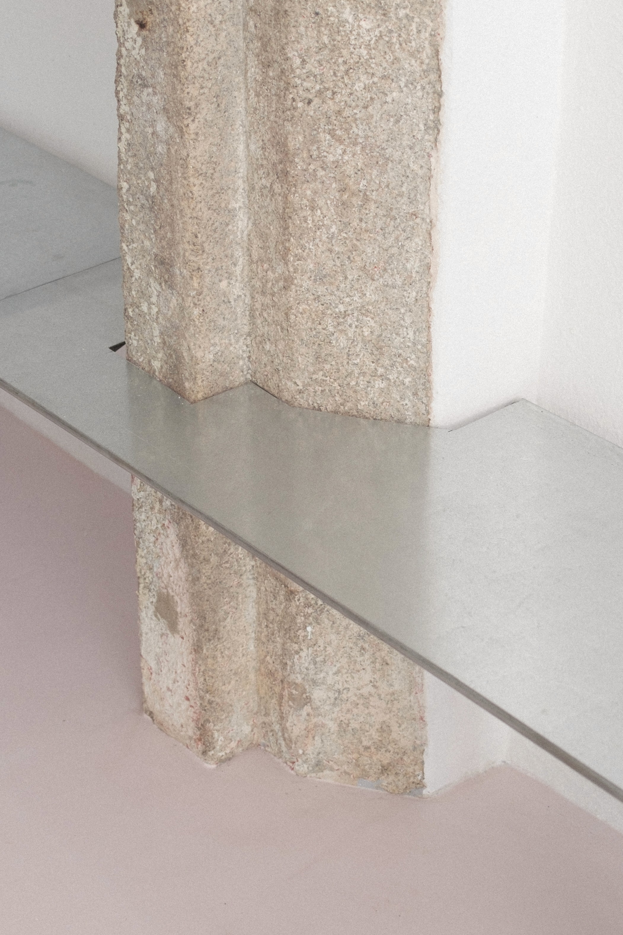
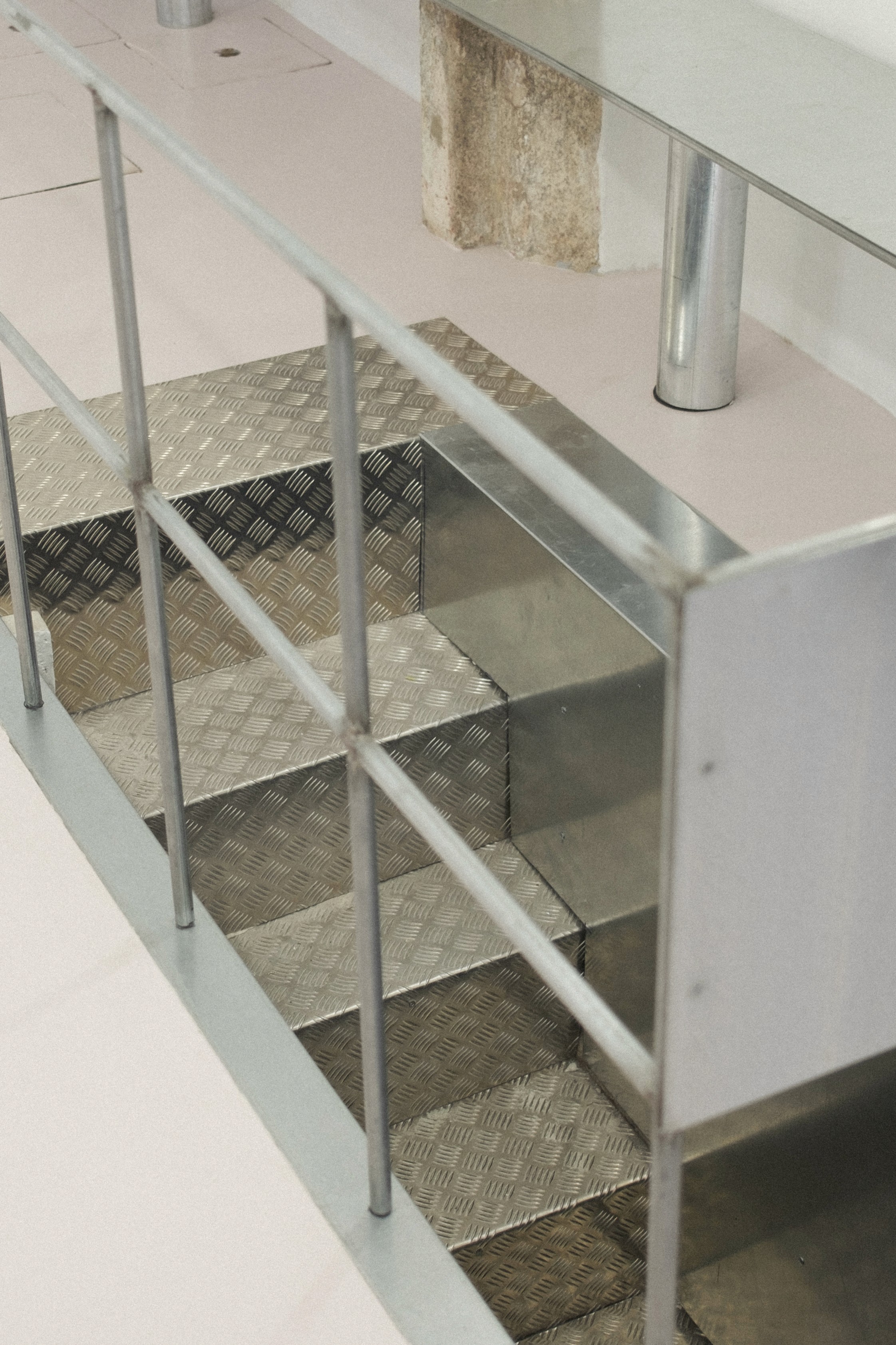
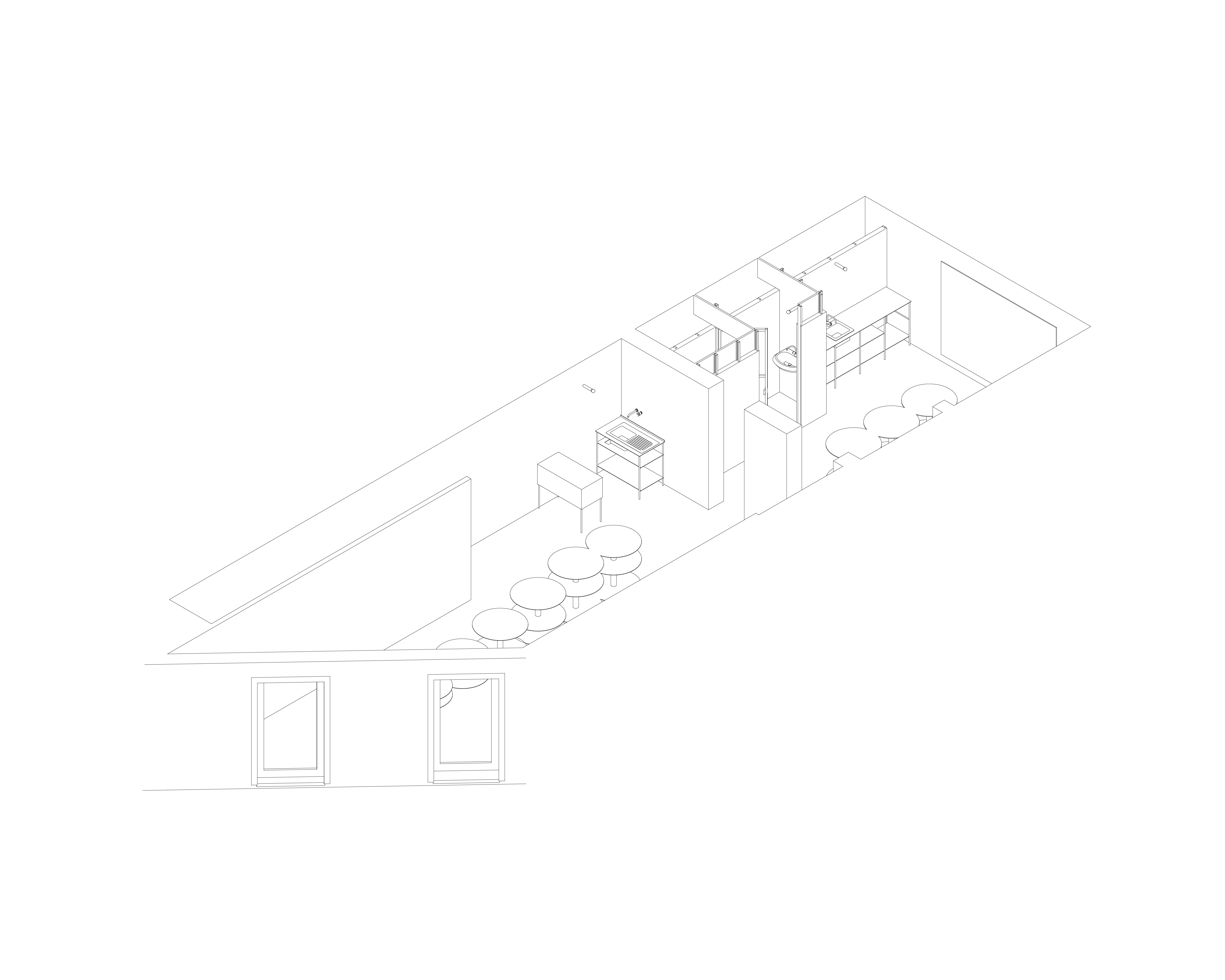
Our proposal was to strip away anything superfluous, embracing a cleaner and more functional aesthetic. The design concept started with the creation of two main zones. The first, accessible from Rua do Rosário, serves as a display and retail area, with a more commercial feel, open to the public. The second zone, more private, was designed for the team members. The design reflects a contrast between geometric shapes: straight, orthogonal lines on the sides are juxtaposed with a central composition dominated by circles. The circle, one of the oldest shapes in mathematics, is simple yet infinite, with no beginning or end. This form evokes balance and is frequently found in nature.
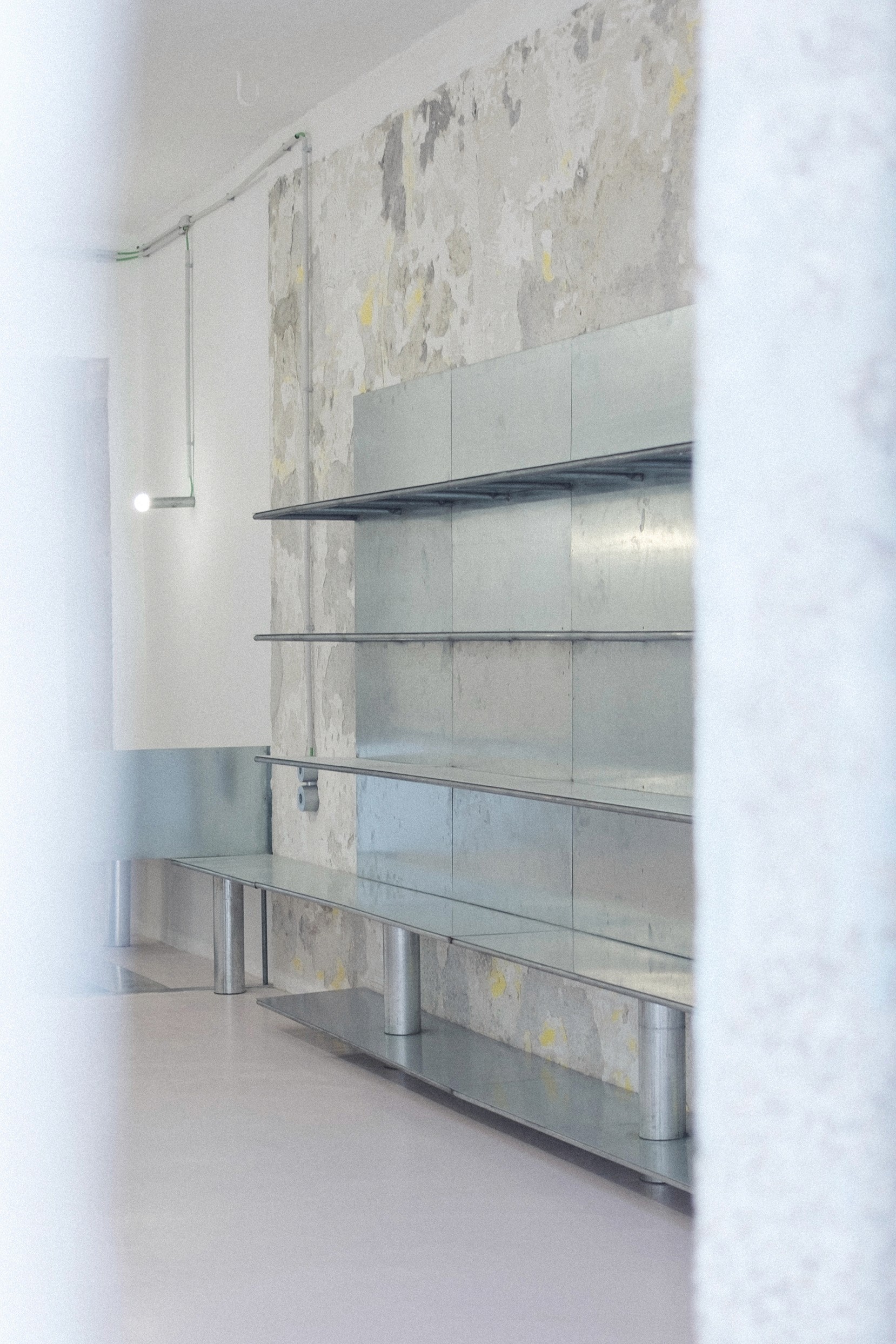
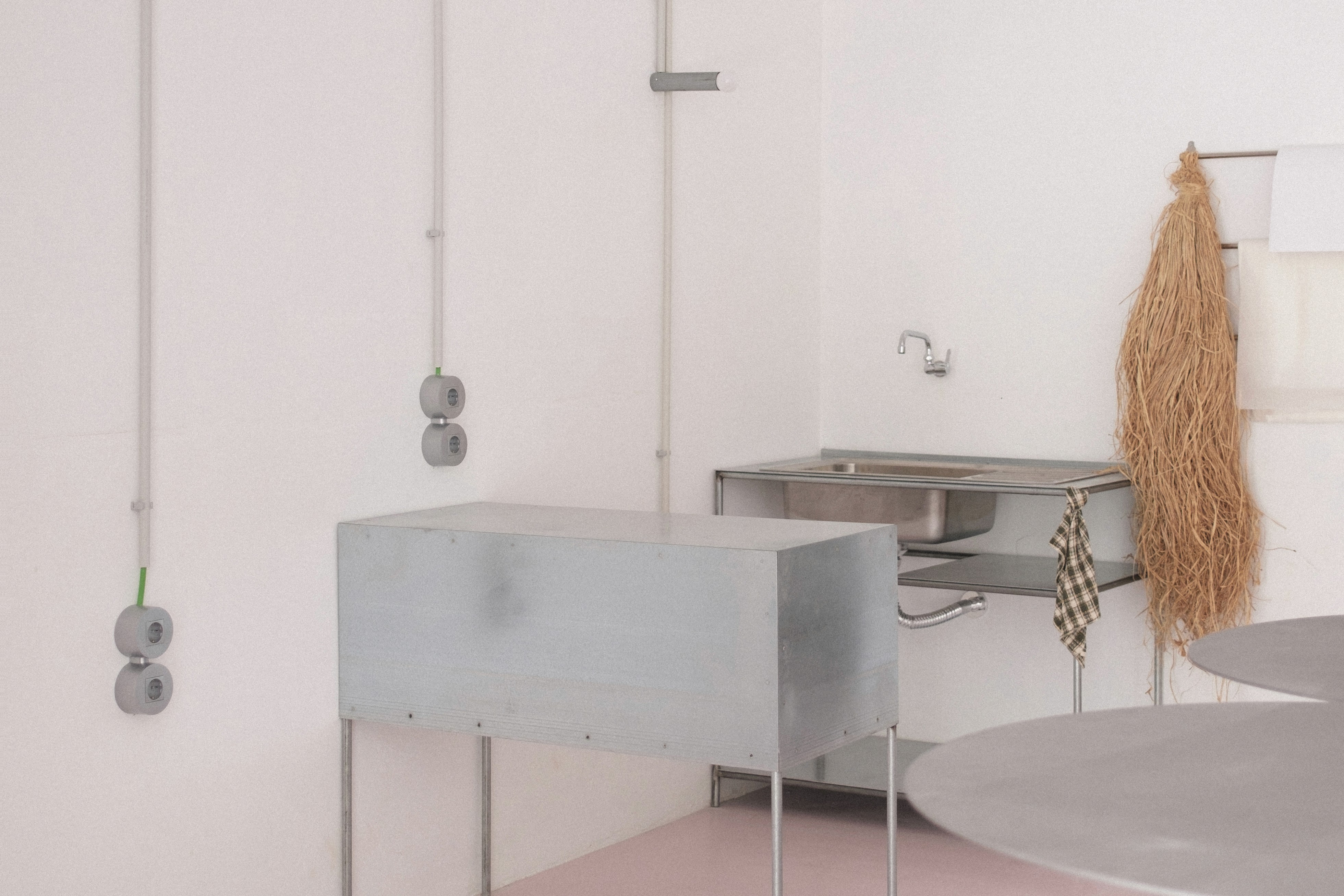
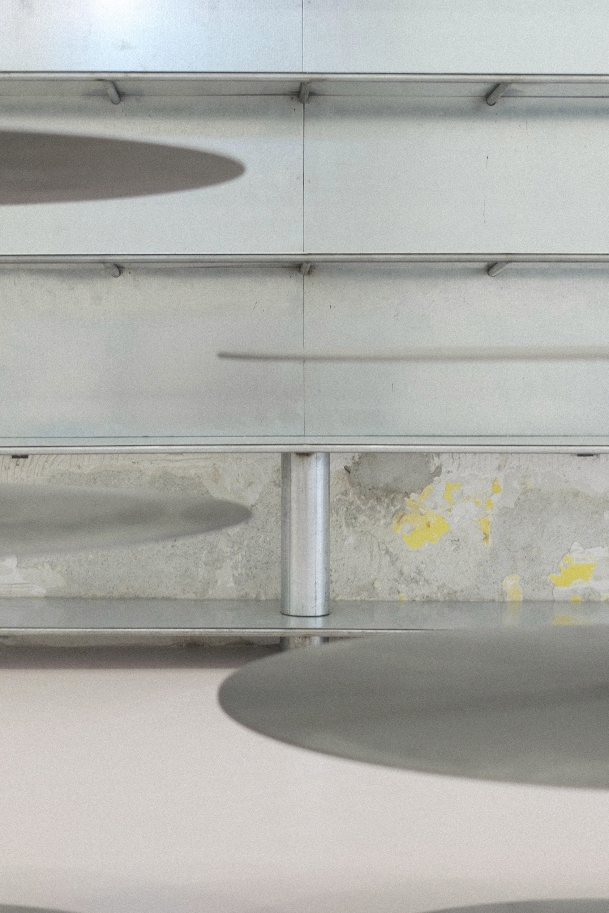
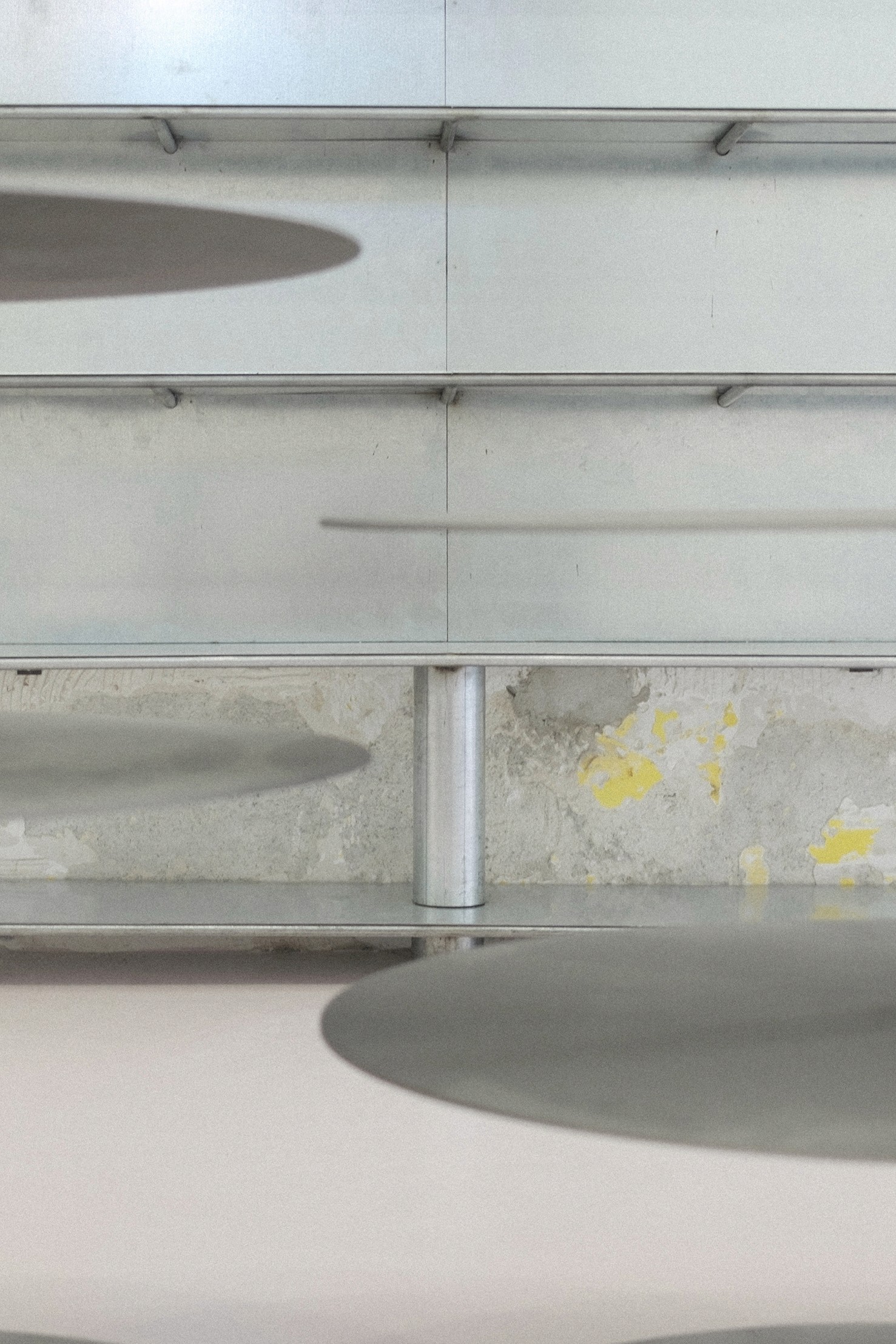
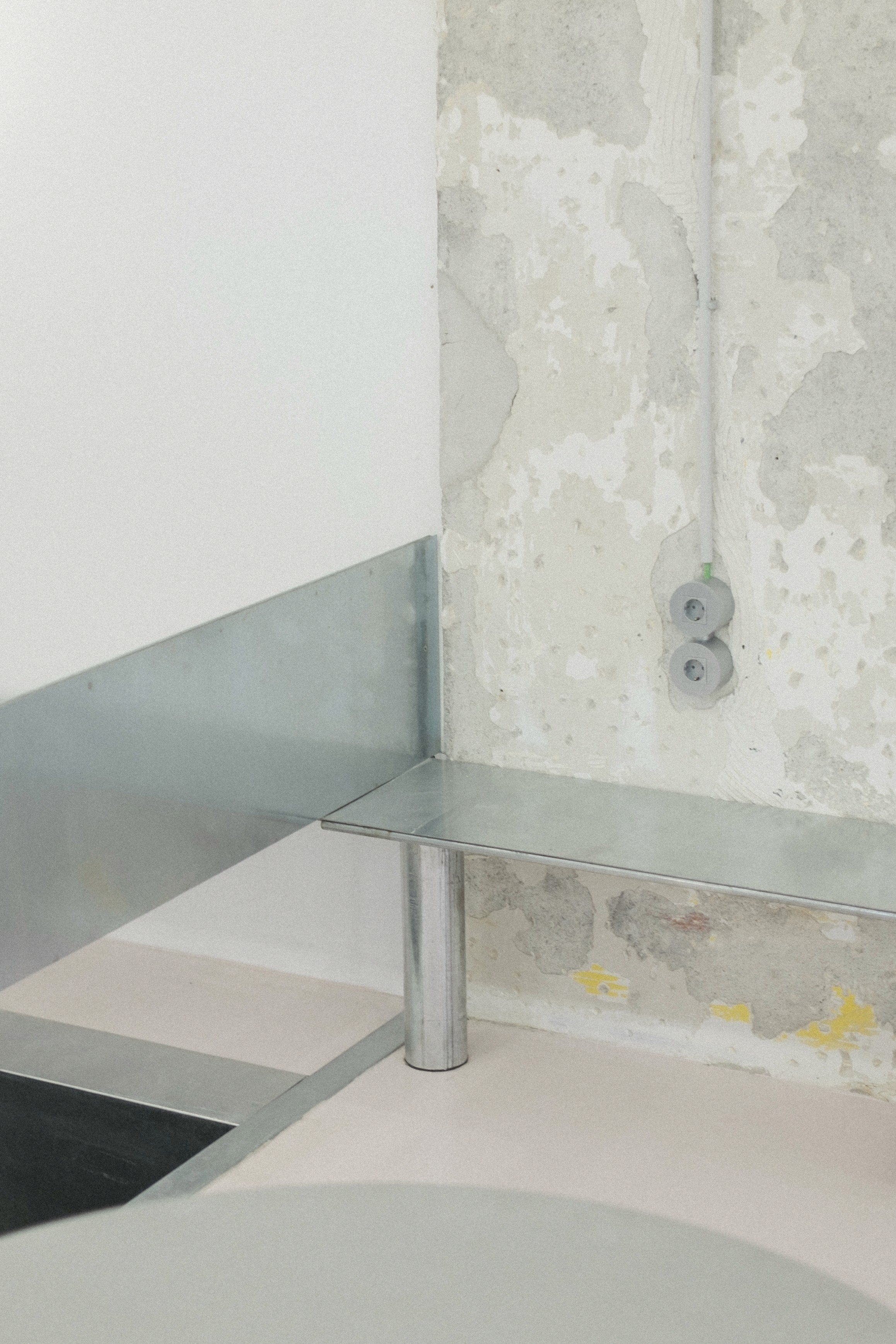
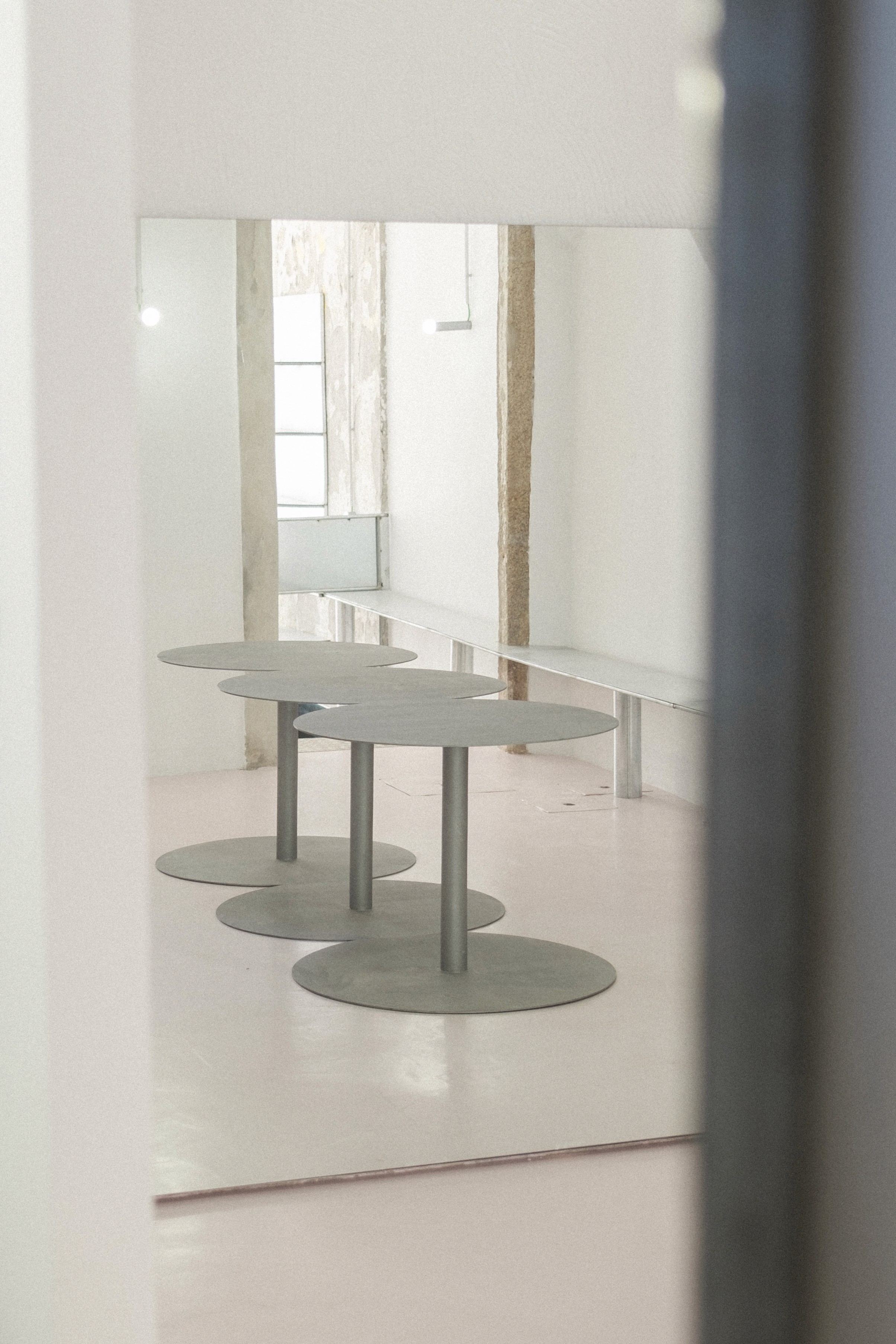
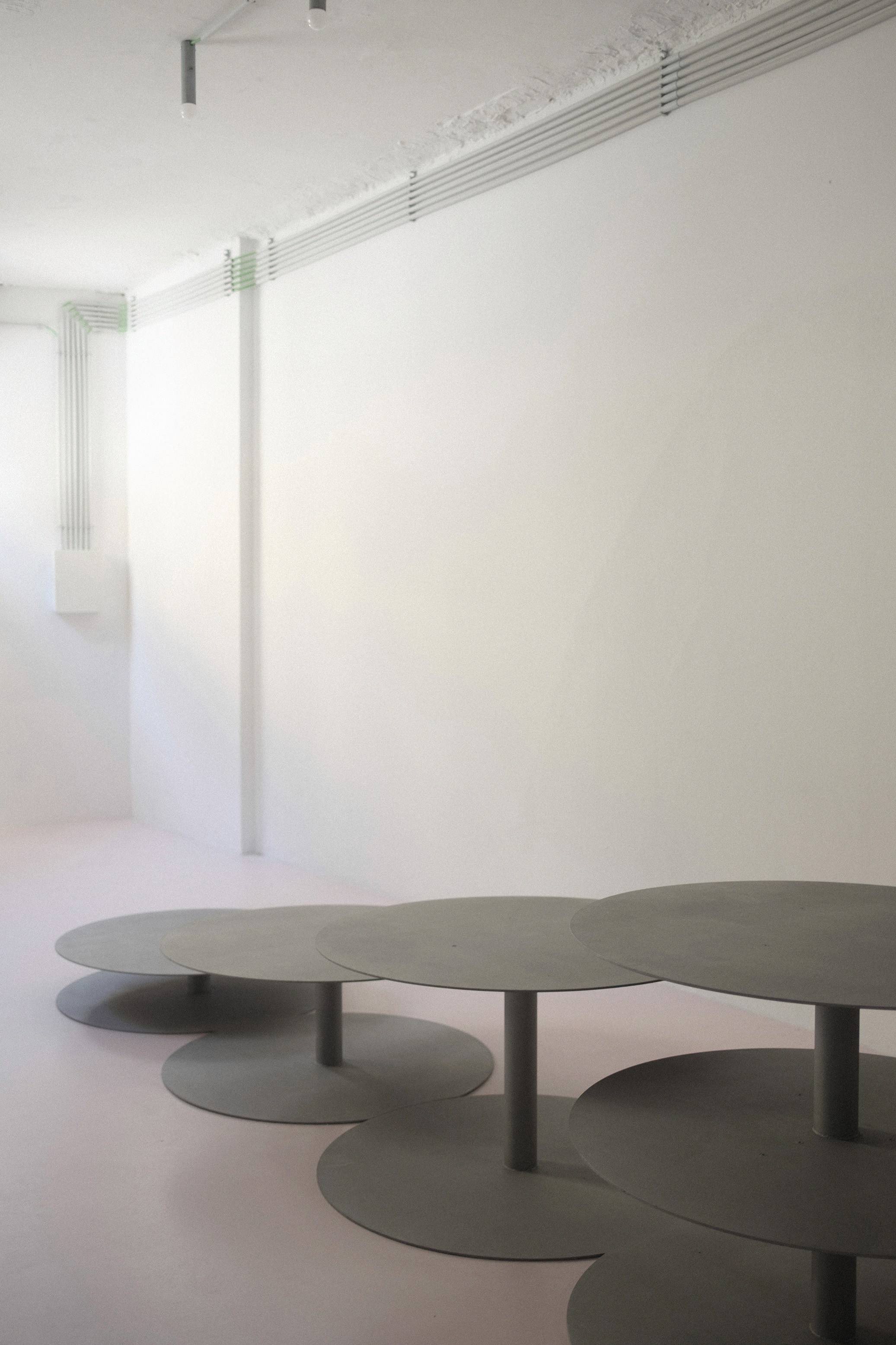
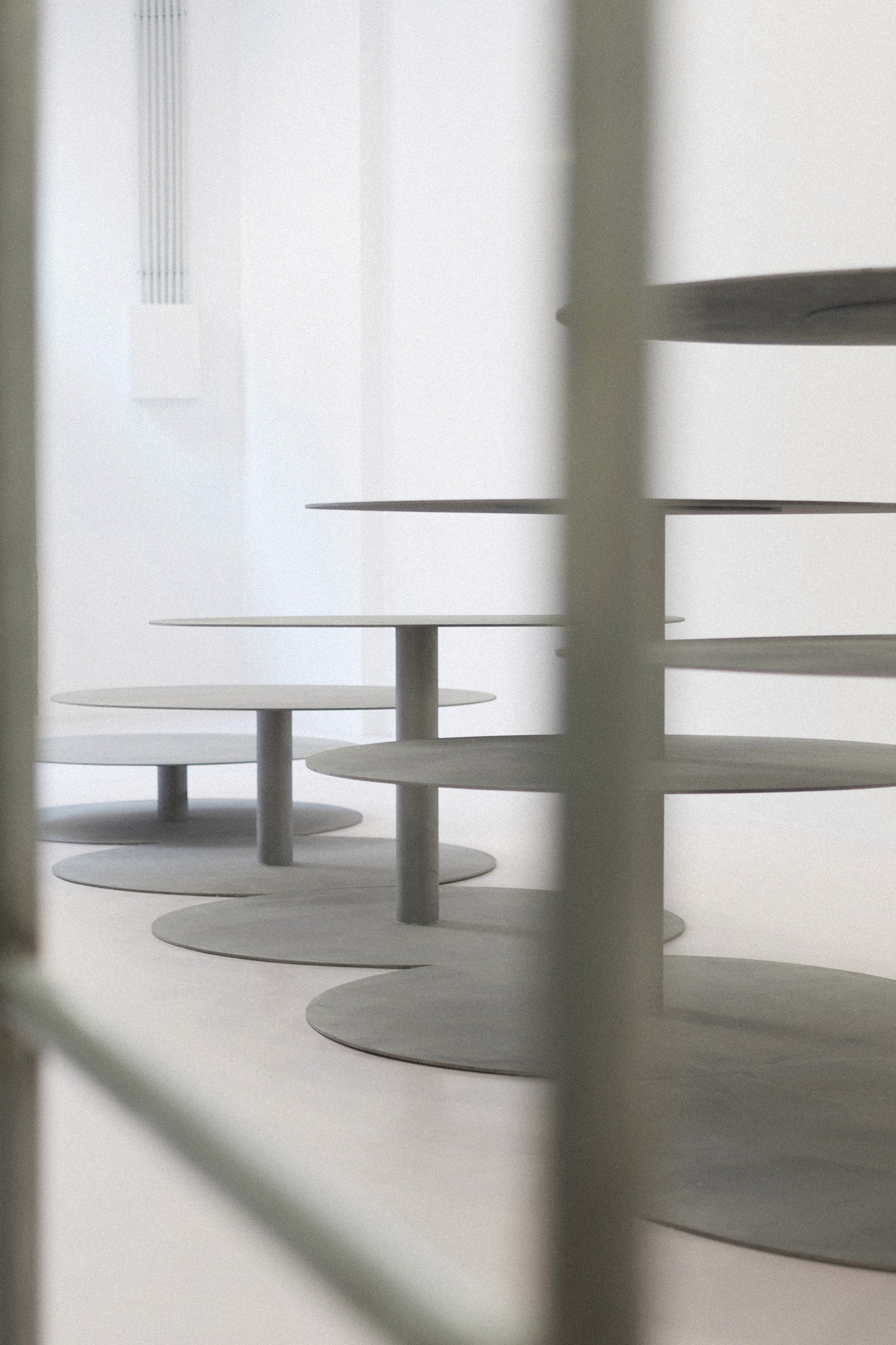
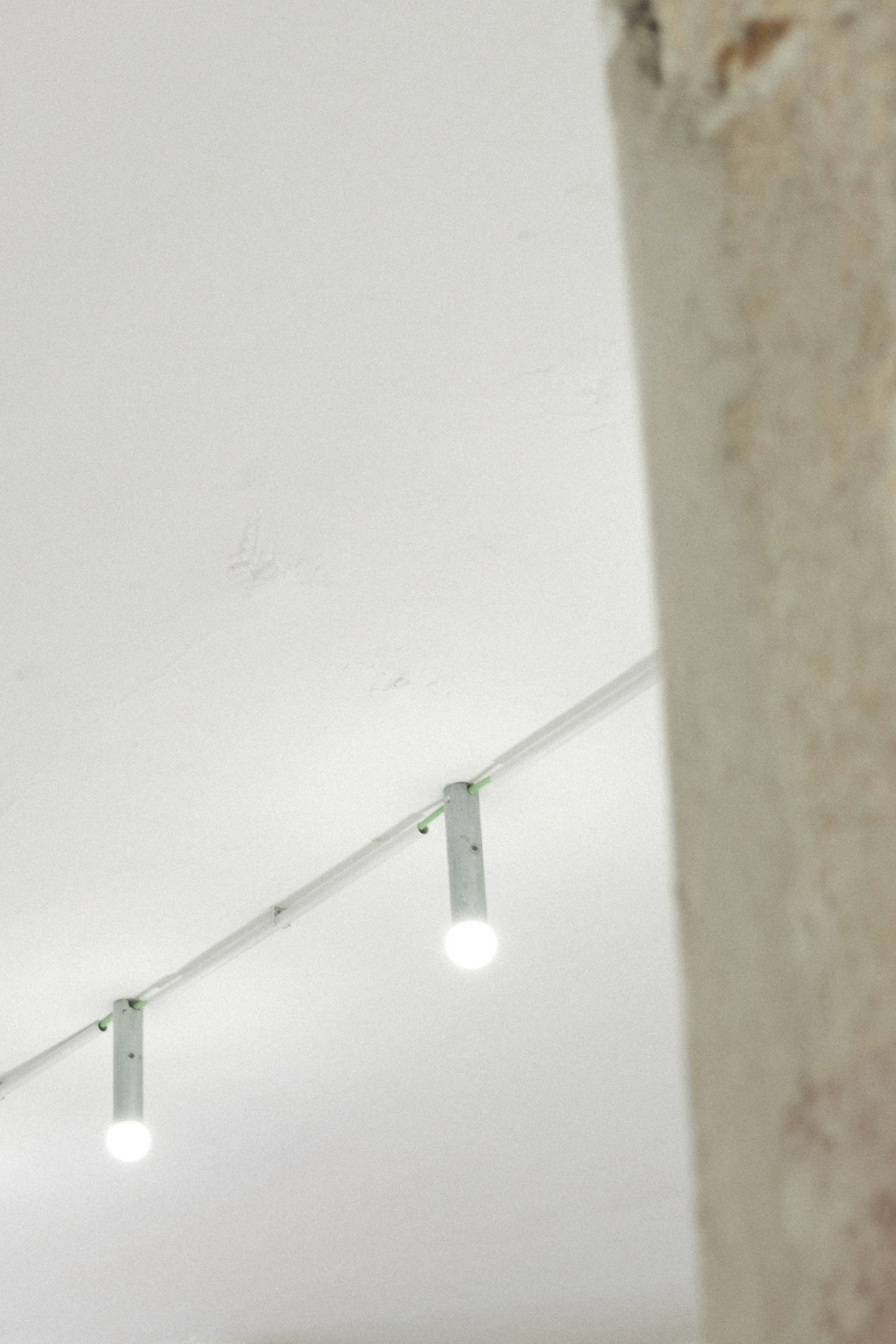
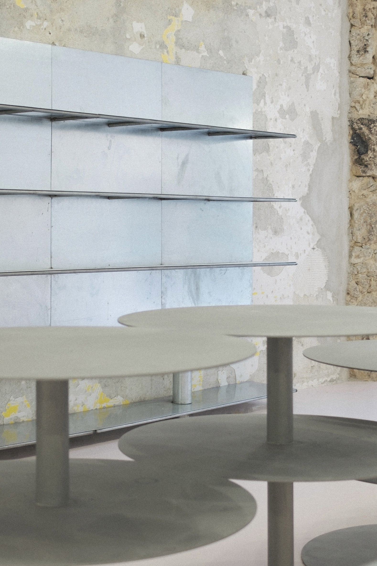
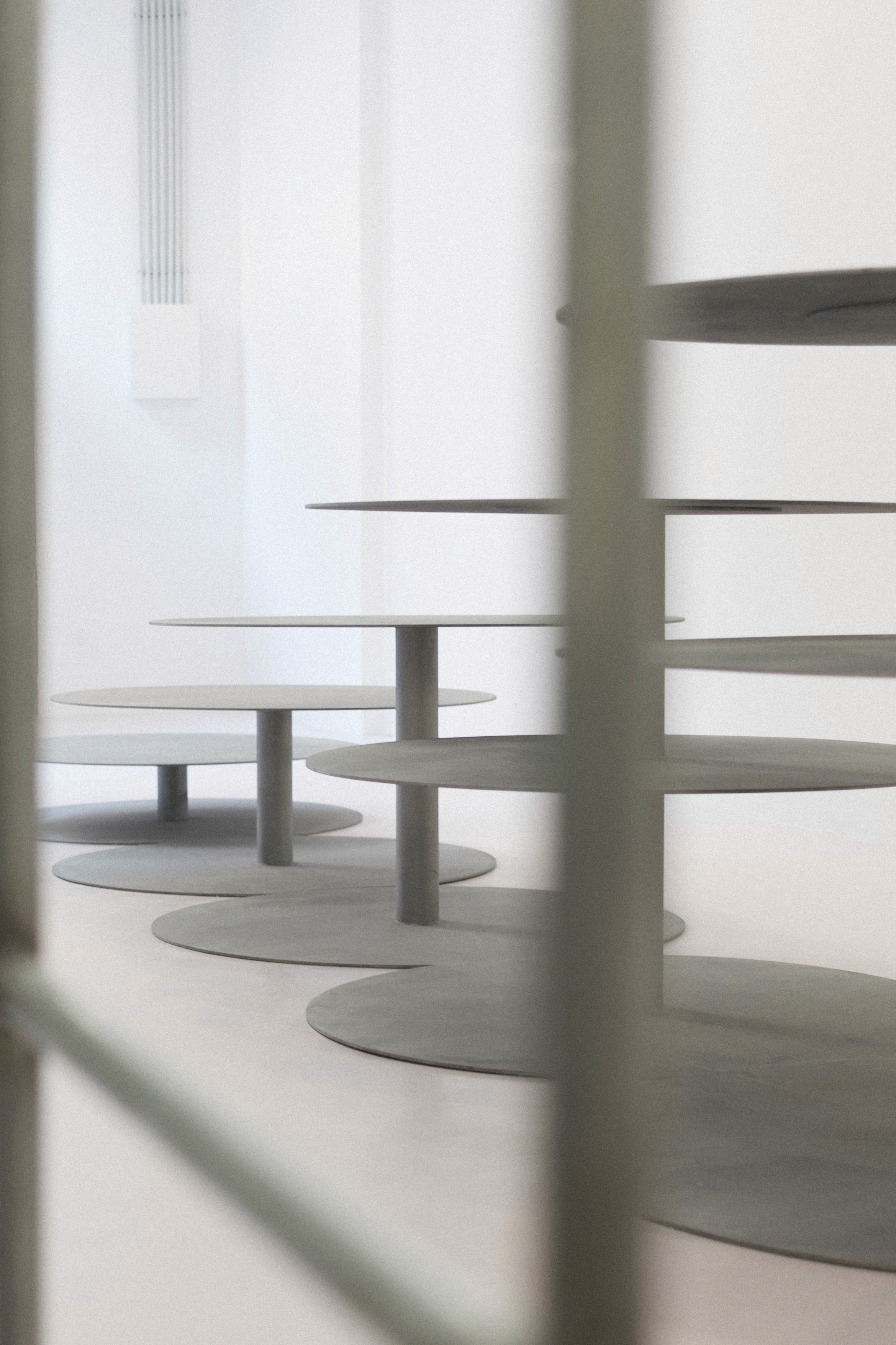
At the heart of the two spaces are two circular surfaces. The geometric beauty of the soft, delicate light circles and the simplicity of the shapes led to the idea of designing a repetition of overlapping and layered circles. People naturally gather in circles when they want to observe something together — here, they are invited to admire flowers. This central axis is further emphasized by strategic lighting points and a large mirror at the back of the space. The materials and colors selected for this project include metal, stainless steel, and a soft "coquette pink". The space will gain a new dimension once it is filled with the brand’s objects and flowers for sale. The overall design takes an industrial yet minimalist approach, balancing circular shapes in the center with straight lines along the sides.



















Interested in learning more about our projects? Contact us to discuss your architectural or design needs.
Interested in learning more about our projects? Contact us to discuss your architectural or design needs.
Interested in learning more about our projects? Contact us to discuss your architectural or design needs.
Client
Menez
Use
Flowershop
Work
Interior Design
Product Design
Location
Rua do Rosário 44, Porto. Portugal
Team & Collaborators
Inês Moreira
/ Architect + Interiors
Miguel Moreira
/ Interiors
Photography
IMCOLLECTIVE
imcollective ©2025 · imprint · shipping & returns · livro de reclamações
Our collaboration with the clients began by sharing references and understanding their goals for this new chapter of the brand. From the outset, we felt a perfect connection. The existing space, characterized by a long, narrow layout, dark tones, a variety of materials, and multiple partitions, created a dense and segmented environment.
Our proposal was to strip away anything superfluous, embracing a cleaner and more functional aesthetic. The design concept started with the creation of two main zones. The first, accessible from Rua do Rosário, serves as a display and retail area, with a more commercial feel, open to the public. The second zone, more private, was designed for the team members. The design reflects a contrast between geometric shapes: straight, orthogonal lines on the sides are juxtaposed with a central composition dominated by circles. The circle, one of the oldest shapes in mathematics, is simple yet infinite, with no beginning or end. This form evokes balance and is frequently found in nature.
At the heart of the two spaces are two circular surfaces. The geometric beauty of the soft, delicate light circles and the simplicity of the shapes led to the idea of designing a repetition of overlapping and layered circles. People naturally gather in circles when they want to observe something together — here, they are invited to admire flowers. This central axis is further emphasized by strategic lighting points and a large mirror at the back of the space. The materials and colors selected for this project include metal, stainless steel, and a soft "coquette pink". The space will gain a new dimension once it is filled with the brand’s objects and flowers for sale. The overall design takes an industrial yet minimalist approach, balancing circular shapes in the center with straight lines along the sides.